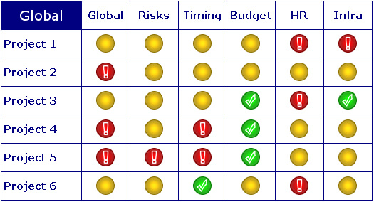
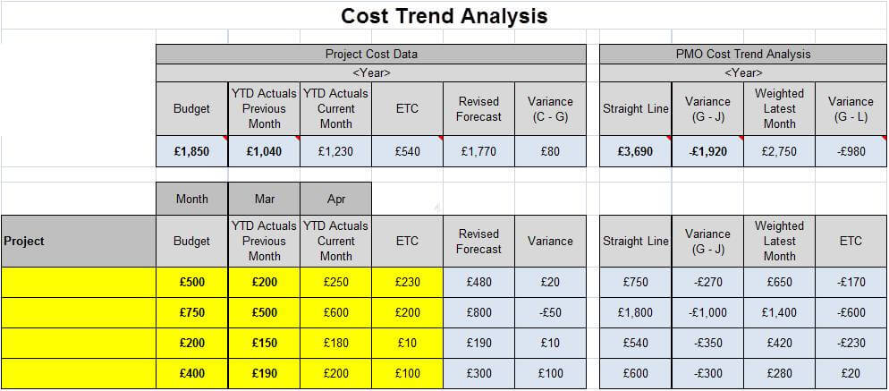
The post PMO Dashboard, used the analogy of how a car dashboard to help think about the design of a PMO dashboard. The key principle being, make sure that you have the dials and gauges that provides the information required. The post also went on to provide an example of a heat-map to demonstrate how key data could be presented on a single page.
This post shares an example of a simple PMO dashboard that allows the status and key aspects of projects to be shared. The data contained in the example, forms a good foundation for the design of more detailed reports.
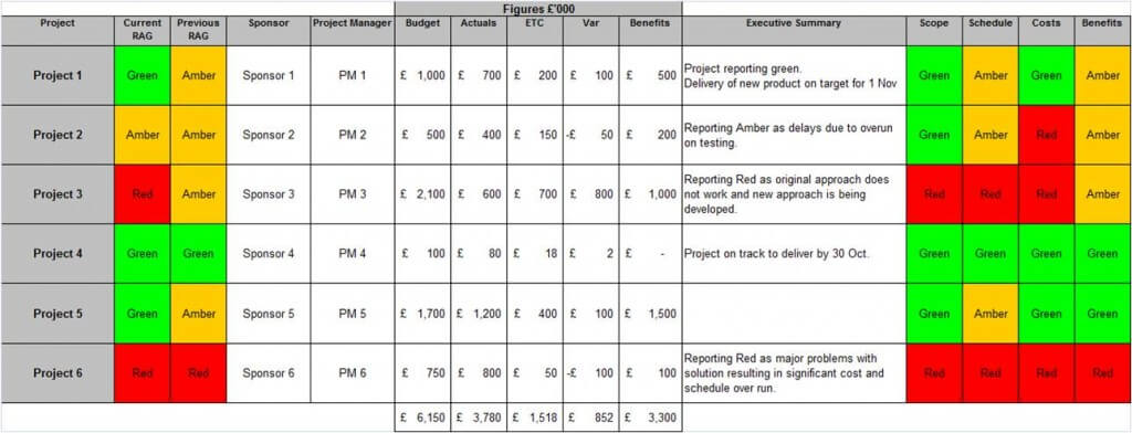
PMO Dashboard – Key Data Items
- Project Name – listed down the left hand side of the page.
- Current RAG – allows the audience to quickly see current status.
- Previous RAG – RAG reported in last reporting period. This allows the audience to see if health of project is improving or deteriorating.
- Sponsor – useful in steering committees as it makes sure the sponsor knows and feels accountable. It also allows them to be asked to explain status and, when Amber or Red, what is being done to get the project back to Green.
- Project Manager – similar principle to the reasons for Sponsor.
- Budget – overall agreed budget. Some organisations like to show budget for current year as opposed to total for multi year projects.
- Actuals – how much of the budget has been spent.
- ETC – estimate to complete or sometimes termed forecast. This is where the Project Manager must realistically predict how much more budget is required to complete the project.
- Variance – simple calculation of Budget less Actuals less ETC. Positive means under spending, negative is overspending.
- Benefits – total benefits that will be delivered. Again may be only for current year.
- Executive Summary – 2 to 3 bullets that very clearly articulate the status of the project and any action being taken.
- Scope – RAG to indicate if scope is on track.
- Schedule – RAG showing if the project is running to plan.
- Costs – indicates if project is keeping to budget.
- Benefits – RAG to indicate if the project is on track to deliver stated benefits.
Hopefully you can see from this simple PMO dashboard, the information is not complicated, nor is the design. Using this data as the foundation, you can then spend time creating a very attractive dashboard and augment with other relevant data.
For example, you may choose to display the sum of the cost and benefit data as pie charts / dials. You may want to display a summary of how many projects have improved, deteriorated or stayed the same. Once you have the data, there are so many options. Just remember to make sure that the data is of value and deserves to be on the dashboard.
Summary
Hopefully this post has dispelled any myths or concerns that building PMO dashboards is hard and complicated. Once you have the data, you can create some really simple but powerfully dashboards.
