Over the last few posts, I have been covering the reporting challenges for a PMO when the Agile project methodology is being used. One of the popular ways of representing progress being the use of project burn-down charts.
In this post I want to provide a simple guide to how you can build a project burn-down chart using Excel. In order to illustrate this I am going to use the example of an Agile Sprint.
Sprint Example
- 5 day duration
- 8 tasks
- 80 available hours
Step 1 – Create Data Table
All reporting requires an input, typically data. This date must be stored in a structured way so that it can be efficiently processed and used.
The date table for the sprint needs to contain the following:
- Daily hours used by task
- Daily total hours used
- Baseline hours by day (the available hours known as ideal hours)
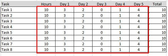
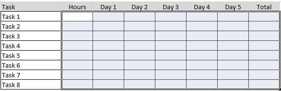 Step 2 – Define Tasks
Each task that is to be included in the sprint should be entered into the table. It is important to use consistent naming so that each task is clear and links back to the item in the Product Backlog (this contains all of the features / requirements of the project). Note: there can be many items in the Sprint that link to a single item in the Product Backlog. This is because the tasks in the sprint represent the decomposition of the item in the Product backlog to allow the tasks to be allocated.
In the example I have simply entered them as Task 1 to Task 8.
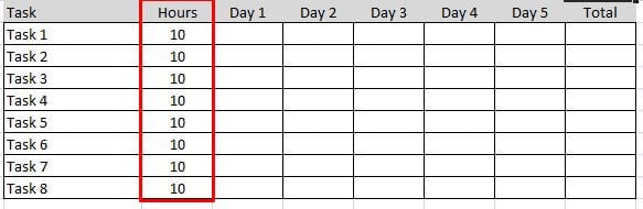
Step 3 – Enter Time Estimate for Task
As part of the sprint planning, the team should have estimated how much each task will take. The sprint is then adjusted so that the total effort estimated for the sprint is equal to the sprint budget (this is the available hours taking number of resources multiplied by available working hours).
The estimate for each task is then captured in the table. This is important as it is used to create the baseline.
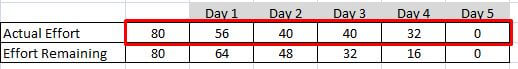
 Step 4 – Create Estimated Effort
This will represent the ideal baseline for using the available hours over the sprint. So in the simplest for this is the available hours divided by number of days. In this example, 80 hours over 5 days equating to 16 hours a day.
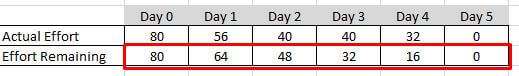
In order to create the project burn-down chart, the data needs to be captured as a daily running total starting with 80 hours than 64 hours left at end of day 1 (80 – 16), 48 hours left at end of day 2, etc.
Step 5 – Track Daily Progress
The daily progress is then captured in the table against each task. It is important to remember that the value captured for each day is the estimated effort to complete the task, not the actual effort.
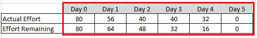
 Step 6 – Actual Effort
The total remaining effort needs to be captured at the end of each day. This is the total (sum) of all of the estimated time remaining at the end of each day.
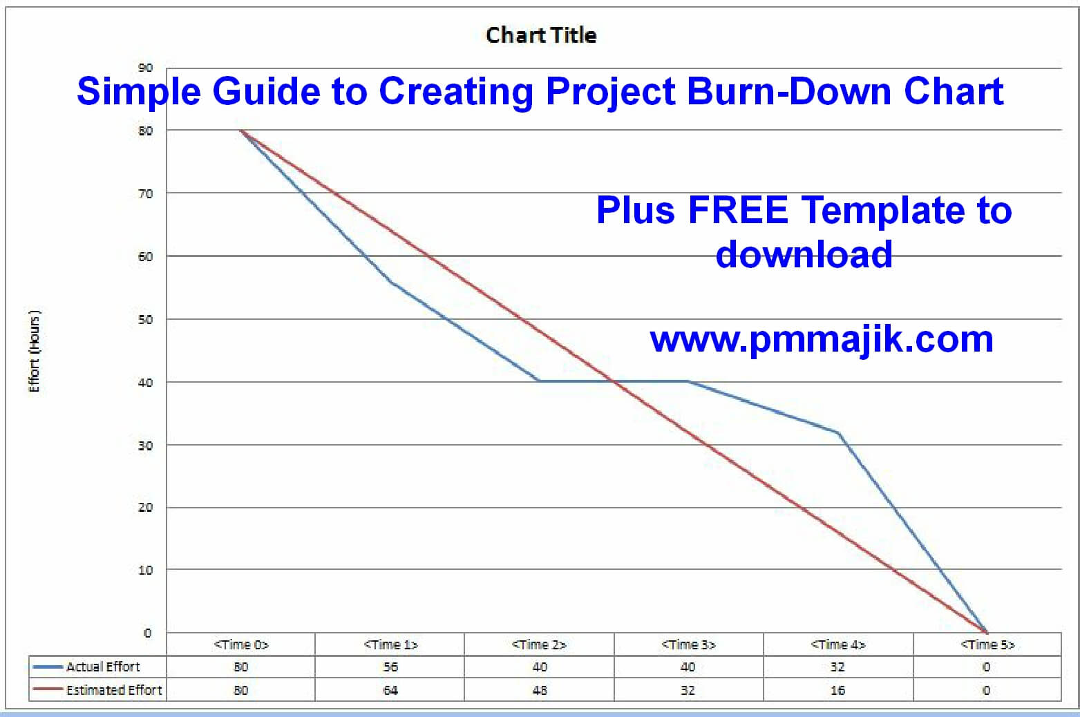
 Step 7 – Create Project Burn-Down Chart
When the data is available, the project burn-down chart can be created. This is relatively simple using the line chart option available within Excel.
Highlight the summary table that contains the daily total for baseline effort and estimated effort. You should also capture the heading of time period (Day 0, Day 1, etc).
From the insert option in Excel select the Bar Chart option and this will create a burn-down chart for your data.
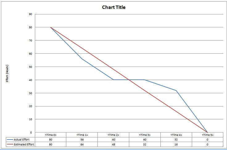
Then if you update any data point in the data table, the graph will update.
You can format axis, legend, colours, etc to suit your requirement.
Congratulation’s you have a project burn-down chart.
Other Types Burn-Down Chart
The same principle applies if you want to track other data types in a burn-down chart. For example, for a milestone burn-down chart the baseline will be created by the number of milestones to be achieved at each time segment. The progress will be captured as the number of milestones remaining at the same time segment.
Free Project-Burn-Down Chart Template Download
To compliment this guide, you can download the supporting template by using the link below. It will also save you time if you do want to create a burn-down chart.
Click Here – Project Burn Down Chart Template Download
Summary
It is very simple to create a project burn-down chart as long as you know what data you are tracking. The result is very powerful.
I trust you have found the guide and template helpful. Please share with friends and colleagues who may find this information useful.
If you are interested in fully integrated frameworks and templates with guides and training tutorials, please take a moment to visit the PM Member’s Area.
Agile Burndown Chart Presentation