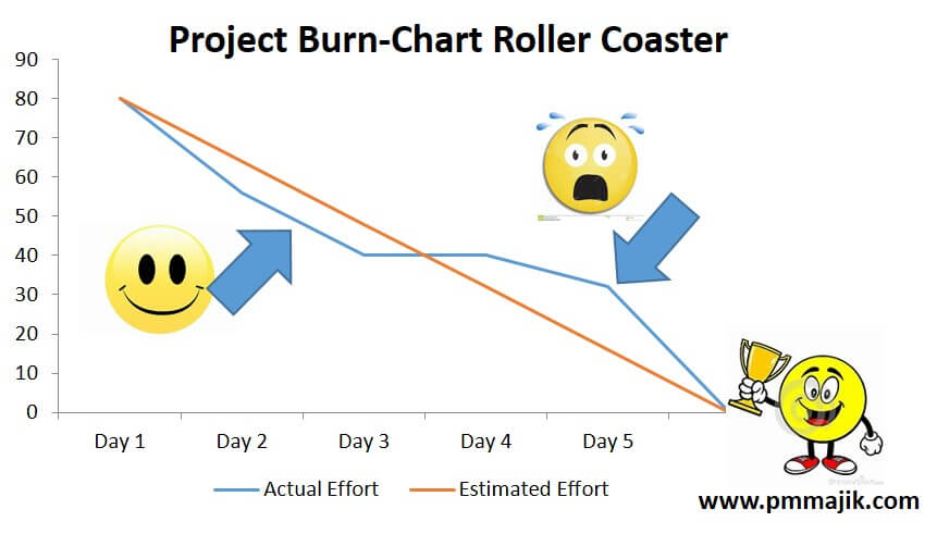
A popular method of reporting progress when using Agile Project Management is the use of burn-down charts.
Wikipedia defines a burn-down chart as:
“A burn down chart is a graphical representation of work left to do versus time. The outstanding work (or backlog) is often on the vertical axis, with time along the horizontal. This is a simple yet powerful method. It is very easy to quickly understand if work is ahead, behind or on schedule.
However, it is worth remembering that burn-down charts were used before the popular use of Agile. In the past I have used burn down charts to show progress against critical milestones and fixed budgets. The chart is flexible and can be used for a number of situations.
In this post I want to cover some basics of burn-down charts and how they can be used.
What is a burn-down chart?
A burn-down chart is a graphical representation of the completion of something against a defined baseline. Put another way it is work left against time.
This is typically achieved by plotting the activity on the x axis of a chart against time on the y axis. The chart will read from left to right with the starting position as the first plot.
As time progresses the progress against the baseline is captured. The data is then plotted so that it is easy to see progress against the defined baseline.
Why use a burn-down chart?
The burn-chart is a simple way to represent progress against baseline using a single chart. It is very easy for the audience to interpret and understand the:
- Start Point
- End Point
- Baseline
- Progress to date
The difference between the baseline and progress line means it is very easy to tell if work is on, behind or ahead of schedule.
Most people who are reviewing the chart will be able to estimate the slope of the progress line so as to estimate if the project will complete on time. Note: while the baseline will typically be represented as a straight line, the progress line will vary. This means the slope will not be consistent and may mean that the best interpretation is by viewing the most recent plots as opposed to the entire line.
What can be tracked?
The simple answer is anything where you are tracking work over a defined period of time.
Examples being:
- Actual budget V baseline budget
- Milestone completion v baseline milestones
- Deliverable completion v baseline deliverables
- Test case completion v test case baseline
- USE case completion v USE case baseline
- Agile story completion v Agile story baseline
- Task completion V capacity baseline
I have used burn-down charts for budget and milestone tracking as, the nature of a set deadline does help focus the mind.
The use of a chart is also useful where space is an issue on a dashboard / status report. It allows a lot of information to be communicated in a small space.
WARNING: be mindful of your stakeholder’s favoured method of receiving information. Some like visual representations so the burn-down chart is a good choice. However, others may prefer tables of numbers or bullets. Choosing the right one is critical.
How to interpret burn-down charts?
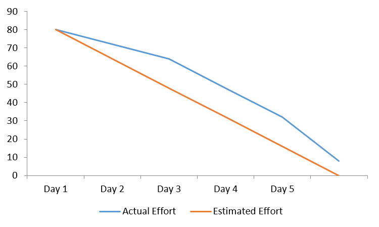
In this example the actual effort line is behind the baseline (estimated) effort. This shows that the project team is behind schedule and if you look at the right most plot, there is work outstanding at the end. So all project activities have not been finished.
The actual line above estimated should be interpreted as behind schedule.
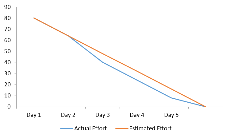
In this example the actual effort line is ahead of the baseline (estimated) effort. This shows that the project team is ahead of schedule. In this example work tracks to schedule first couple of days and then the team accelerates effort, shown by increased gap between lines.
The actual line below estimated should be interpreted as ahead of schedule.
In this example the actual effort line is deteriorating to day 3 with the amount of behind schedule growing. Then at the midway point (indicated with the arrow), the team accelerates effort and closes the gap and catches up to complete on time.
If you were reviewing daily trends, you would see by day 2 that the trend was going the wrong way allowing you to take action i.e. add resources to complete activities over remaining days.
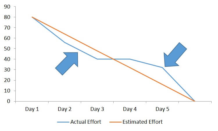
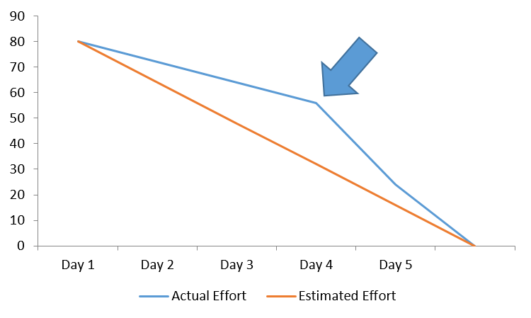
In this example the project team starts strong and gets ahead of baseline (see left side arrow). However, work then slows and from day 4 the team is behind schedule. Action is taken at point of right hand arrow and the team catches back up to finish work.
This may indicate inconsistent performance in the team. The project manager should investigate to understand reason for sudden change.
Summary
This guide has provided an overview of burn-down charts and some tips on how to interpret. In the coming posts I want to provide further guides on creating burn-down charts and some template downloads.