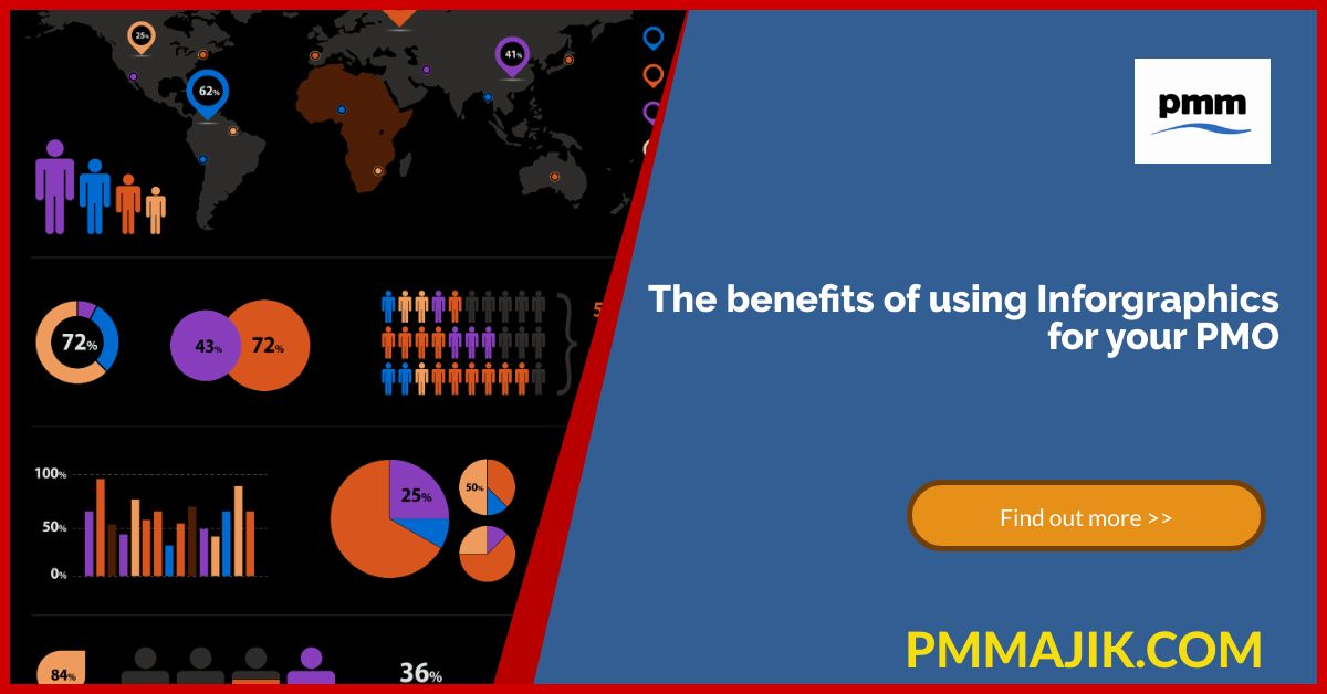
Infographics are a useful way to represent data and communicate stories in your project management office (PMO). You’ll have seen infographics across social media used by a range of businesses, but what are the benefits of using infographics in your PMO?
We’ve explored what it takes to make an infographic truly useful and the tools you can use to add infographics into your communication plans. You’re going to be investing time and resources into using these data representations, so it important to understand why.
In this blog, we’ll be looking at;
- Some of the main benefits of using infographics in your projects and PMO
- Ideas for infographics that’ll deliver what you’re looking for
- How you can measure the success of your infographics
What are the benefits of using infographics in my PMO communications?
It seems every company is using infographics as part of their communications strategy. It’s with good reason, too. There are different reasons to use infographics, such as:
- Communicating your PMO role to your project teams and wider business
- Engaging your project managers in their KPIs
- Raising the profile of your PMO within your industry through content
What are the reasons infographics are successful for this? Here are the top three.
Knowledge retention
When you present data in different forms, it’s easier for people to retain it. Using graphics to represent your data and even animate it makes it more eye-catching and can increase engagement.
Building infographics into your training can help your team remember their tasks or understand how their KPIs are measured, for example. When it’s important that your project managers or their team retain detailed information, pairing a long text with infographics will appeal to different learning styles.
Some examples where an infographic can be used to distil knowledge across your team include:
- Outlining the objectives of a project – you can show the different sprints that will be needed if you use Scrum, or the flow of a project if your PMO uses Waterfall.
- Pitching a project to the C-suite – if your PMO is business-focussed and helps to choose projects, you can use infographics to show the benefits of a project when pitching to the directors.
- Introducing new processes – timelines are a common form of infographic that can show the steps in a new process like preparing a report or using a new software.
You can measure the success of these infographics by using quizzes or surveys of the people using them. The fast adoption of a process or a smoother project timeline should also indicate success.
Forming connections across business areas
Using infographics can help you tell a story. You may need to communicate the purpose of you PMO if you’re in a start-up company or setting up a new office.
When your PMO covers different locations, getting the same message across to everyone is paramount. Rather than a text-dense comms that may be hard to search through, sending an update with an infographic makes sure everyone gets the message.
Ways you can connect across your business with infographics include:
- Telling the story of a project success using numbers, testimonials from stakeholders, and images of the outcome.
- When you have a project that changes something across the business, such as a new clocking-in procedure, part of the project can be to use an infographic to present the new process.
- Presenting weekly statistics across the business in an accessible way that negates the need for long meetings to give out the data.
To know if your infographics are successful, you can run a quick survey across the business to understand attitudes. You should also get more engagement with materials, such as more visits to your intranet pages.
Results tracking
Presenting the headline data of your PMO’s KPIs can demonstrate your value across the business and how the office contributes to strategy. It’s also a useful way of showing your project manager how they’re doing with their projects.
You can have a standard infographic format for your project teams to use to show track their KPIs each month. A yearly tracker infographic will also have value to show stakeholders and your team.
The take home
Infographics will make the data from your PMO easier to understand. The benefits of using infographics in your PMO include improving the knowledge of your project teams and wider business as well as making it easier for everyone to know how well you’re tracking against your KPIs.