Infographics are a new way of communicating data to your team. It’s there to parse information and make it understandable for everyone and more engaging than a traditional report. Before you can harness infographics in your project management office (PMO), you need to ask the question “what does a good project management infographic look like?”
Your PMO will produce lots of data points and monitor a whole range of metrics. Although you and you analysts will be comfortable with scanning a sheet of numbers and knowing what it means, it doesn’t mean everyone can.
To make people care about your information, you need to communicate it well. Infographics are great tools and have become wildly popular in recent years. So that you can harness the potential of infographics in your PMO, we’ll look at:
- What you need to know before you start your infographic
- The key ideas you need to include in your PMO
- Some ideas of what data you can represent in your infographic
I want to use infographics in my PMO, where do I start?
There are some basic questions you need to answer before you can even start to plan the content of your infographic. Knowing these early on will make sure your infographic doesn’t go spiralling out of control.
First, you need to know your audience. An infographic that’s just going out to your project managers will look very different to one that lands on your company’s public blog. The audience will dictate the type of data you represent and the language you use.
Next, think of how you’re giving out the information. Making a poster will need font sizes to be thought about, whereas if you’re sending it through a WhatsApp chat you need to be sure it will work on most phone screens.
Finally, you can start to think about what information you want to communicate. We’ll give you some specific ideas later on, but in general make sure that it’s:
- Relevant
- Useful
- Gives fresh information or perspectives
What does a good infographic look and feel like?
Once you’ve got the who, how, and what sorted, you need to get your PMO’s infographic output to be valuable. It’s no good just taking a load of data and adding colours and fonts. Here’s some principles you need to work with.
Clear and concise
Visually, your infographic needs to be easy to understand. Avoid swirly fonts, make text sizes suitable for your form, and check all your text and background colours are easy to see. Also be aware of colour blindness and visual impairment issues.
Use only the data points you need. Infographics are there to highlight the really important information.
Tell a story
Know what the point is of your infographic and relate each data point to the final message. Put your statistics or facts in a logical order so the reader can follow what you’re trying to get across.
Two layers of meaning
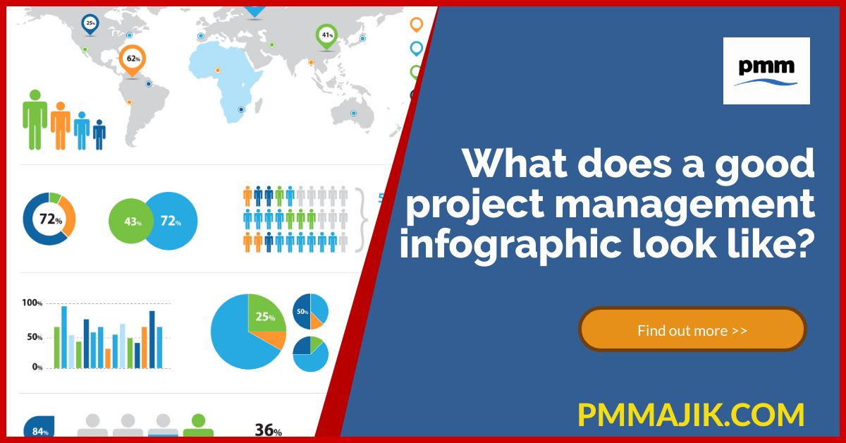
A great infographic will work on two levels. Initially, it should present information quickly so the headline is understood – using partially filled human outlines to represent absence or a pie chart with two or three colours will instantly convey a message.
After that, when read in detail there should a real opportunity to learn something new. This can be through text explaining the details of the data or how it relates to the strategic goals of the business or PMO.
What information from my PMO can I show in an infographic?
With so many reports, it can be hard to know where to start. You can use infographics to communicate data to your managers, the wider project team, the C-suite, or to the business at large.
Some ideas of what you can tell through infographics include:
How your Scrum teams performed against expectations for the week, showing financial and time budgets, milestones hit, and overall progress of the wider project.
What your PMO has achieved over a quarter, with projects completed, training hours delivered, and employee retention rates, among other data.
Track your KPI progress with a monthly infographic. Range your representations with some being complete data for the period and others being a gauge of how close you PMO is to hitting target.
The take home
Knowing what a good project management infographic looks like will ensure that your time is spent wisely. By knowing exactly what you intend to say, and then clearly telling a story that has a deeper meaning, you will engage your team and help them understand the journey of projects as well as the PMO.