In your project management office (PMO) you might be missing a trick if you’re not using maps to present your PMO data. There are different types of maps that work with PMO data, depending on your size and your needs.
Using maps is an accessible and engaging way to present data. You don’t need to be a multinational company to take advantage of map data – not every map is of a geographical region.
To really get to grips with using maps in your PMO data, we’ll be looking at:
- The different types of maps you can use in your PMO
- What practical uses each style of map can have
- How to create accessible maps for your PMO
What are the different types of maps I can use in my PMO?
Maps generally show a geographical space and can include data about the area or show features of the area being mapped. You’ll generally deal with adding data to a map in a PMO.
The main types that you’ll be able to harness will be:
- Geographical maps showing the world, a country, a region, or even an area in your office
- Roadmaps to illustrate the expected direction of a project or the PMO in general
- Heatmaps which are a different way to visualise data, presenting novel information in an informative way
Heatmaps are different to geographic maps. They’re a way to show data in context. We’ll explain more about heatmaps when we come to discussing their uses and how to make them.
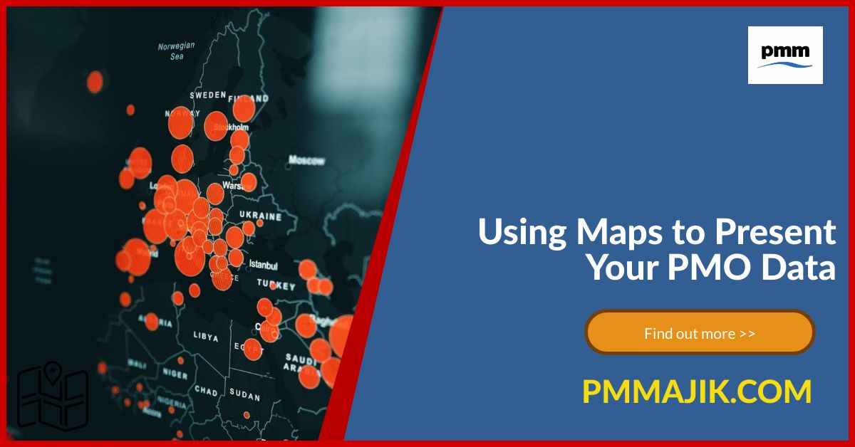
How can I use geographic maps in my PMO?
A geographic map is one that just shows information based on a location, it can be static or interactive. It can be a map on a poster, as an infographic on your blog post, or as an interactive element in a presentation.
This can be a very effective way of communicating your data that everyone in your organisation can understand. By showing your data pinned to different locations, it’s easy to make a comparison between regions, countries, or areas.
Some examples of how you can use a static map to communicate your PMO data include:
- International comparisons of the same data points such as budget adherence across countries
- Regional variations in deliverables, showing how two or more regions compare on project completions
- Team comparisons illustrated on map of the office floor showing how each project is performing in line with KPIs
Using a tool like Visme, you can pick maps of different countries or regions and add data or change the colour of each country or area. You can make an interactive map with a range of datapoints that are accessible to users when they rollover the area. More localised maps may require some graphic design skills.
What can I show on a roadmap in my PMO?
Every project that falls into the scope of your PMO should have a clear plan. Usually, tasks will be broken down over a number of weeks and months, with expectations clearly set.
By showing this plan as a roadmap, it will be really easy for everyone one a project to see how the team is progressing. You can be as creative or simple as you like – maybe showing a vehicle on a journey or a climber on a mountain, with milestones clearly identified.
Even a simple timeline mapping out where you expect your teams to be at certain dates will be easy to work with. It’s also simple to track progress, and everyone likes crossing out a task as it’s complete and monitoring their progress.
What can a heatmap bring to my PMO?
A heatmap is another way to visualise data – it uses colours in the same way that a bar graph would use height to show you the difference in data. Heatmaps work well for information that might be new to your audience and adds a fresh layer of understanding.
Assign a colour to a data range, e.g. 0-50 is red, 51-100 is amber, and 101-150 is red, and each square on a grid highlights with that colour with any data in the range. When people aren’t familiar with what a “good” or “bad” outcome is, using colour as a highlights offers a visual reference.
It’s a simple function in a spreadsheet to program a cell to highlight a different colour in a value range. You can make more complicated and nicer looking heatmaps with graphic design packages.
The take home
There are different types of maps that you can use in your PMO to present data. Whether you want to show comparisons across areas, how a team is progressing through a challenge, or how common a range of data is, maps are a valuable tool in your communication arsenal.