Your project management office (PMO) is a hub of data. You’ll hold myriad data points on individual projects as well as general project efficiencies. When you’re using data visualisations in your PMO you can get the best value of your office’s data.
Data visualisation is becoming more common and you’ll likely see it as a feature of resource management or budgeting software. It’s important to get to grips with data visualisation in your PMO, so we’re going to answer:
- What is data visualisation?
- How is data visualisation different to an infographic?
- What ways can data visualisation be used in a PMO?
- How does a PMO benefit from using data visualisation?
What’s data visualisation and why does my PMO need it?
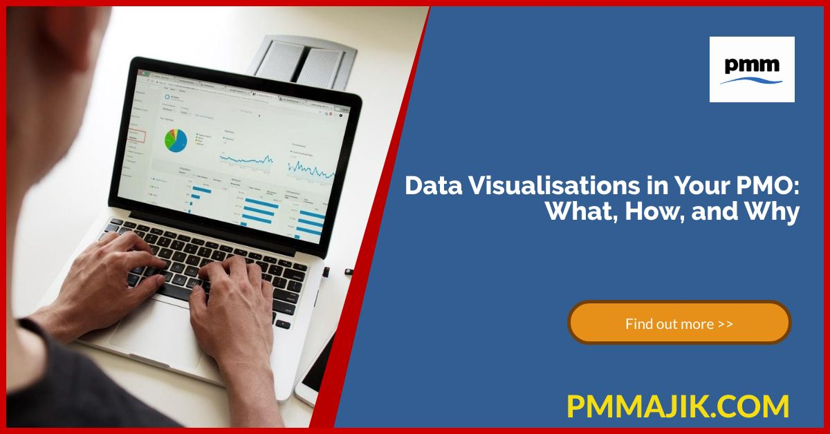
Data visualisation is the name given to how you present a data set as a chart or graph. It’s a way of taking bundles of data out of a spreadsheet and showing it in a familiar way to your team and your superiors.
Usually, data visualisations wade through big data sets, such as your team log in times or spending information, and pull it together to make it clear. The data should begin to make sense and even come to life when you find the appropriate way to present it.
With a data visualisation, you will:
- Describe the situation your PMO is currently in
- Illustrate trends and identify outliers
- Understand the future direction to take in terms of strategy
How are infographics and data visualisations different?
When you create an infographic, you’re using a range of data to answer a question or tell a story. You collect information together and add graphics and representations to make it clear and understandable. Infographics are there to inform.
A data visualisation focusses on using one set of statistics to present a situation and/or a solution. You’ll see data visualisations used to make a business case or to show an argument in favour of a course of action.
How can I use data visualisation in my PMO?
Since one of the major functions of a PMO is to collect data on project metrics, it’s ripe for some data visualisation. Consider the datasets you have, such as:
- Project timeline adherence
- Budgets, costs, and spending
- Human resources outputs
- Compliance with processes
Then, think about how that information could be useful to you.
You can use these data to track trends over time – maybe your projects are running over time more and more often, or your project teams are being more productive. Visualising the data rather than looking at raw numbers will show you trends and patterns.
Another useful data visualisation tool are metric dashboards. You may be getting data in real time or daily and want every project manager to see that data. Having a standard chart that can be accessed each morning will help everyone keep on top of numbers.
Generally, if you’ve got a question about the performance of your PMO, you will have data to answer it. All you need to do then is find a way to visualise it so that you can prescribe actions based on it.
What are the benefits of data visualisation to a PMO?
There is a lot of power is being able to look at data over time. Having information in a clear and visual format can help you clarify ideas that you may already have, like whether you may be reaching 100% FTE in your human resources.
You may also find yourself corrected with your data visualisations. For example, analysing a year’s worth of exit interview data may uncover previously hidden reasons why project team members leave.
The graphs and charts that you use in data visualisation are accessible. Give most people a spreadsheet filled with number and they’ll derive little meaning; present them with a line graph accompanied by a pie chart and it should make more sense.
The take home
They might not be as pretty as infographics, but data visualisations can show your PMO the direction you should be moving in. They display data that you store in a clear way and can pull out trends and outliers in your PMO.
Data visualisation in your PMO should make your decisions more logical. You will clear reasoning behind recruiting new people, updating your software, or even changing your project methodology. Let your data speak for itself.