This is the 2nd post in the 4 part series covering the steps involved in measuring and improving the maturity of your PMO.
The last post covered Understanding the current level of PMO maturity. The primary focus being on the approach and tools for data capture so as to be able to complete the assessment.
This post is going to focus on the next step after you have captured the data. This is the process of plotting the data against a scale to measure PMO maturity.
In order to do this you will need:
- Scale for measuring PMO maturity
- Completed data capture assessment
In order for this to work, the data capture assessment template should ideally have been designed with a view of the scale that would be used. If not it may be difficult to apply a scale retrospective to the answers and may result in you having to go back to the person(s) who provided the input to the assessment and / or unreliable results.
Scale for Measuring PMO Maturity
As with any measure, it is worth spending time developing a scale that will suit your need. In this case the scale must support being able to assess the maturity of your PMO so that you can understand and communicate the level at which it operates.
This means the scale must allow for a PMO that is very much in it’s infancy and offering basic services i.e. just report consolidation. Through to a PMO that provides strategic reporting, advice and guidance pro-actively to senior management.
Consider the Capability Maturity Model (CMM), this provides 5 levels to represent the maturity of an organisation:
Level 1: Initial – processes unpredictable, poorly controlled and re-active
Level 2: Managed – process characterised for projects and is often reactive
Level 3: Defined – process characterised for the organisation and is proactive
Level 4: Quantitatively Managed – process measured and controlled
Level 5: Optimizing – focus on continuous process improvement
This scale clearly demonstrates the maturity and type of service offered at each level. It is easy for people to see that Level 1 is the basic level and Level 5 is operating at a very strategic level.
Define the Scale
This can be as easy or complex as you require. However, my word of caution is keeping it simple is always a good rule.
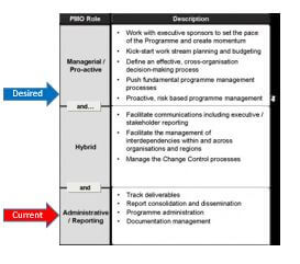
For example, you could use a scale based on the CMM model. Another option is a more simplified scale. An example could be using a model similar to the different types of PMO I advocate:
Reporting / Administrative
Hybrid / Progressive
Managerial / Proactive
Using the 3 levels above, you would then map out what traits you would expect in each level. The diagram below gives an indication of what type of service is expected at each level.
Plot PMO Maturity
When you have a defined scale and the data from the assessment, you are ready to plot the maturity level.
At a very basic level, you can simply conduct a subjective assessment of where the PMO is on the scale. This can either be yourself plotting based on your views or, even better, a group input to decide on rating. If you decide to do it yourself, is worth having someone else review your thoughts and provide constructive challenge.
The ideal approach is to plot based on a defined calculation. This will remove subjectivity and should provide a better result. If there has been data collected over a number of PMO functions, then the information will need to be consolidated to give a score for each function. This gives the maturity of each PMO function.
Reporting PMO Maturity
Like with any information, it is how you display / report the data that helps people to understand what it means.
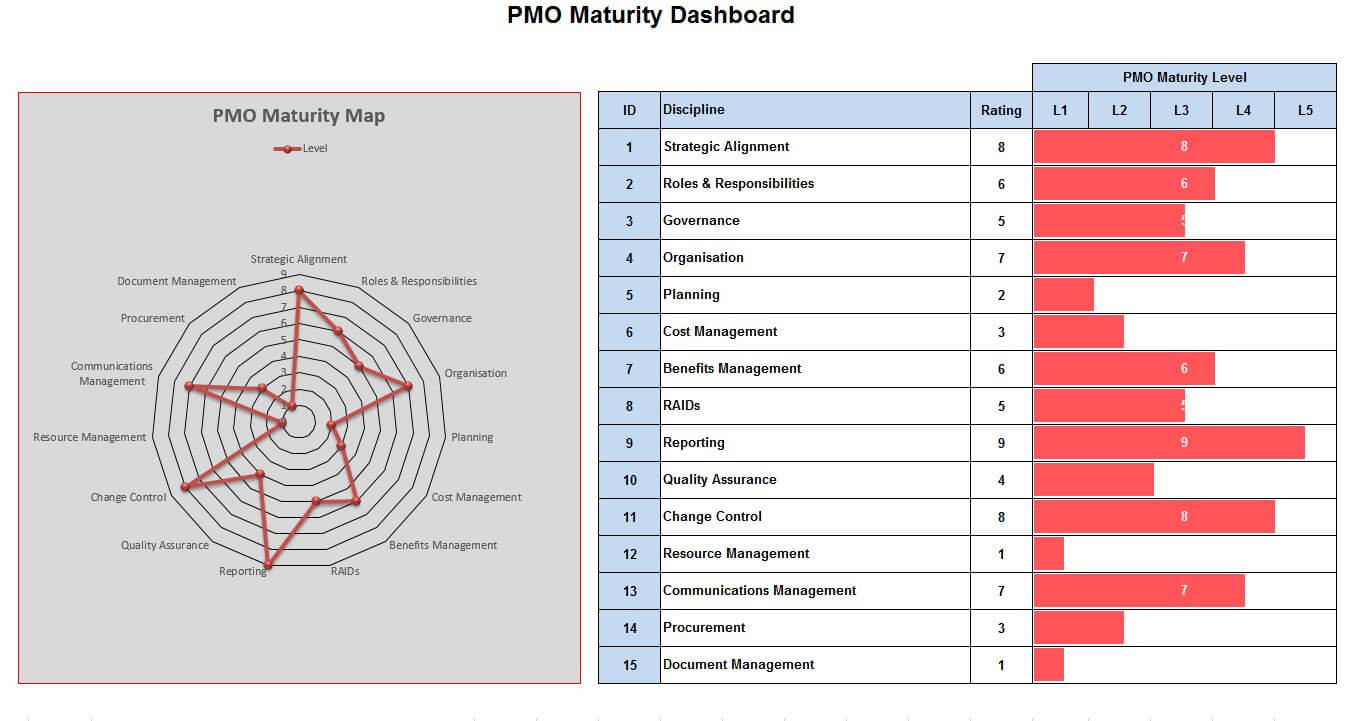
There are a number of methods for reporting PMO maturity in a single view. Good mediums being the radar charts and bar charts.
In the example taken from the PMO Maturity Assessment Framework, the left hand panel provides a radar chart view of maturity, the principle being the closer to the outside edge the greater the maturity for the PMO function. It also gives a good visual of overall maturity.
The right hand panel uses a more conventional bar chart approach against each PMO function with a maturity scale at the top. This allows for the actual maturity level of each function to be understood. This provides actionable data for where improvements need to be made (this will be covered in the post about Identify Areas of Improvement).
Important: In order to plot, visualise and report the PMO maturity level, you must have a mechanism of capturing the required data.
Summary
In order to plot PMO maturity you must invest time defining a reliable scale, suited to your objectives. Having the required quality and level of data as an input is crucial.
The next post will cover how to determine the desired / required level of PMO maturity.