PMO templates are the core tools used by most project management office’s. A number of processes need to be implemented to capture, analyse and monitor data and the mechanism for the standard capture is usually templates.
This post will share 5 tips that will help when it comes to designing templates so as to ensure that they are useable and achieve the required outcome.
1. Ease of use
When you design a template, think about the end user who will need to enter data. Make sure that the layout is clear with instructions. If it is not clear, the template will be filled in incorrectly and / or the user will get fed up and give up (plus probably tell everyone how bad the template is and that the PMO do not know what they are doing and wasting time).
2. Big enough to see
Just because you can set the font to point 6 or less to allow you to fit more data onto the template, it does not mean you should. The design will look very crowded, there may be an overwhelm of data and very difficult to read. Many stakeholders will get upset if they can not read the letters or, think you are using a small font to hide bad messages. Remember the saying “less is more”.
If there is only limited space, educate the project teams to write clearly and only use the words that are needed to convey the information. Senior management will appreciate this as they will quickly be able to understand the information.
3. What does it look like printed?
Most people will print the templates, especially if they need to go into a presentation pack. Try to make sure that the template will fit onto A4 landscape. Run a test print to make sure the design is clear.
Designing for A4 will save a lot of time when you are copying and pasting into a presentation. If you do find you have templates that stretch across the page, try to design them so that the key data needed for a presentation is grouped together on the left, then you can select this region and paste into the presentation.
4. Only add data fields that have a purpose
In post PMO Dashboards, an important point was that a dashboard should only contain fields that need to be there. The same applies to templates. Be hard on yourself and only add data fields that have a purpose. Avoid the nice to haves or the desire to collect data “just in case” someone asks for it!
5. Professional design
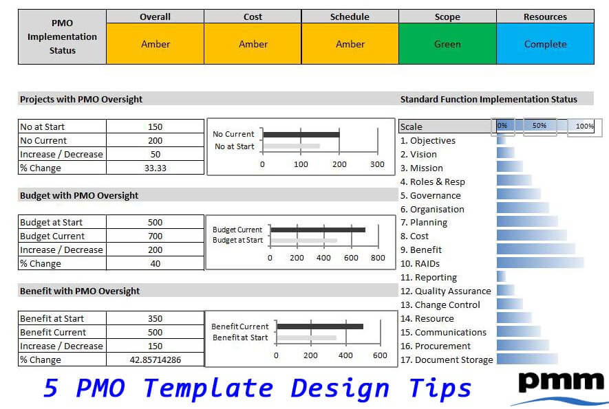
Perception is important as well as first impressions. A well laid out template, using the same font, colour scheme, etc will promote confidence. Make sure that you do think about the aesthetics of the design and that it enhances the data not draws the readers eyes to some ‘clunky’ graphic.
Summary
The investment of time in designing good templates can make such a difference to the users entering the data and the recipients who review the content. Make time to ensure that what is being produced in your PMO passes the grade!
If you are looking for ideas or would like to save time, consider purchasing ready made templates.
PMO Template Design Tips Presentation


